Why you need Shipment Tracking emails?
Have you ever found yourself refreshing your tracking page repeatedly, waiting for updates on your package? We’ve all been there. The frustration, anticipation and endless waiting that makes you reconsider if you’ll ever buy from that seller again.
As an online retailer that has worked so hard to develop a great product and market it, the last thing you need is to be losing customers in your post-purchase and last-mile delivery. Now, you can’t control certain things, like damaged parcels or courier delays, but you can ensure you’re keeping your customers informed at every step of the way.
More than just order updates, tracking emails work as a direct line of communication, offering not just transparency but also an opportunity for personalised engagement that you can leverage for collecting reviews and cross-selling opportunities, for example.
In this blog, we’ll go over some of the best examples of shipment tracking emails that have successfully stroke the balance between functionality and embodying their brand identity. Let’s dive in!
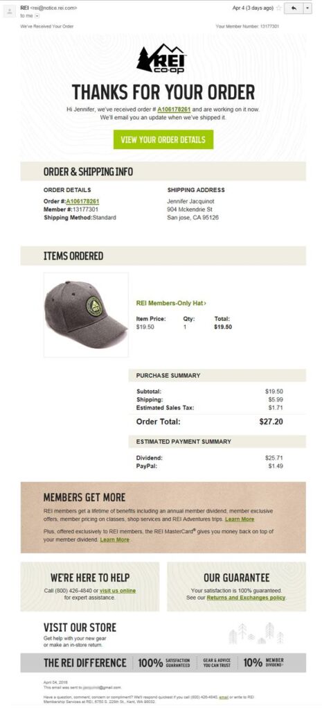
REI Order Confirmation
What’s great about it:
- Strong Visual Identity: REI excels in maintaining a strong visual identity through its email confirmation. The logo is prominently placed, taking centre stage, and the consistent use of brand colours enhances brand recognition and recall.
- Logical Structure: The email follows a logical and customer-friendly structure. Beginning with the order confirmation message sets the tone for a positive customer experience. Next sections provide shipment information and details about the ordered items in a clear and concise way.
- Exclusive Member Benefits: REI strategically includes exclusive member benefits in the email, encouraging customer retention. By highlighting these perks, the brand not only acknowledges its loyal customers but also incentivizes continued engagement with the membership program.
- Clear Returns and Exchanges Policy: Transparency is key, and REI ensures clarity by prominently featuring its Returns and Exchanges policy. This instils confidence in customers, providing them with a clear understanding of the brand’s commitment to customer satisfaction and hassle-free returns.
Backcountry Shipment Confirmation
What’s great about it:
- Brand Identity: The email adeptly displays the brand’s identity with strategic logo placement. Including staff pictures in the support section adds a personal touch, fostering a connection between the brand and the customer.
- Logical Structure: The information flow in the email is well-thought-out. Beginning with the shipment confirmation message sets the tone, followed by a clear item summary and shipment address details. This logical sequence improves readability, enhancing the overall customer experience.
- Cross-Selling Opportunities: Backcountry cleverly integrates cross-selling into the email with a “Picks for you” section. This not only provides added value to the customer but also presents an opportunity for the brand to highlight related products, potentially increasing sales.
- User-Friendly Links and Socials Bar: The inclusion of useful links and a subtle social media bar is a smart move. It allows customers to quickly access relevant pages without overwhelming the main purpose of the email. This balance between providing additional resources and maintaining focus on the shipment details contributes to a positive user experience.
Fitbit Order Confirmation
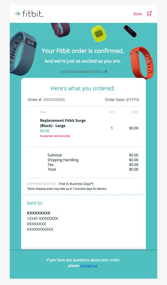
What’s great about it:
- Consistent Tone of Voice: The email maintains a consistent tone of voice that aligns seamlessly with the brand’s friendly and playful identity. This not only reinforces the brand personality but also establishes a memorable connection with the customer. The use of compelling visuals further enhances the overall impression, showcasing the product in a creative and fun way.
- Compelling Visuals: The email incorporates compelling visuals that go beyond mere product representation. By showcasing the product in a creative and fun manner, the brand captivates the customer’s attention and leaves a lasting impression. Memorable visuals contribute to brand recall and create a positive association with the product.
- Simple, Straightforward Layout: The layout of the email is designed for simplicity and clarity. Customers can immediately access all the information they need without unnecessary distractions. A straightforward layout ensures that the key details, such as order confirmation and product information, are easily visible and comprehensible. This user-friendly approach enhances the overall customer experience.
Harry’s Delivery Confirmation
What’s great about it:
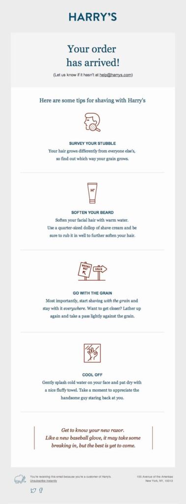
- Strong Visual Identity: Harry’s excels in maintaining a strong and consistent visual identity. The email reflects a minimalistic design, adhering to a strict colour palette, and employs a friendly tone. This ensures a cohesive brand image that resonates well with the audience.
- Accessible Support Contact: Prioritizing customer support, Harry’s provides easily accessible contact information. This reinforces a customer-centric approach, assuring recipients that assistance is readily available should they have any queries or concerns.
- Value Added Content: Going beyond the transaction, Harry’s includes value-added content in the form of tips on how to best use their shaving tools and products. This not only demonstrates the brand’s commitment to customer satisfaction but also adds a personalized touch, showing genuine care for the customers’ experience with the purchased items.
By incorporating these elements, Harry’s delivery confirmation email goes beyond a mere acknowledgment of the transaction, contributing to a positive post-purchase customer experience.
Etsy Order Confirmation

What’s great about it:
- Order Delivery Timeline Design: The visually appealing order delivery timeline breaks down the delivery process into easily digestible chunks. By including the expected delivery date, the seller effectively manages customer expectations, providing a clear understanding of when the order will be received.
- Great Content Hierarchy: The email exhibits a well-structured content hierarchy with crucial information placed strategically. Order confirmation and expected delivery times take the top positions, followed by detailed order information and shop details. The use of stacked individual column sections reinforces the information hierarchy, with promotional content, support contact, and social links placed at the bottom for a seamless reading experience.
- Special Offer for Returning Customers: Recognizing the value of customer loyalty, the Etsy seller entices returning customers with a special offer – free shipping on their next purchase. This not only shows appreciation for repeat business but also serves as a strategic incentive for customers to engage with the shop again.
- Clear Returns and Cancellations Policy: Ensuring transparency and clarity, the email incorporates information on returns and cancellations. By including this essential information within the email, the Etsy seller facilitates a hassle-free shopping experience, keeping customers informed about the shop’s policies.
Chewy Order Despatch Confirmation
What’s great about it:
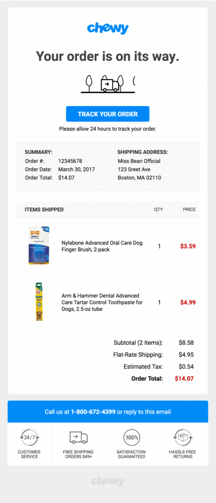
- Simple, Clear Layout: The email employs a simple and straightforward layout, ensuring that users can instantly access the information they need without unnecessary distractions. This user-friendly design enhances the overall customer experience by providing clarity and ease of navigation.
- Animated Header: An animated header is incorporated into the design, serving as an engaging element that makes the email stand out. While maintaining simplicity, the animated header adds a visually appealing touch, capturing the user’s attention and making the overall design more dynamic.
- Product Images for Instant Identification: Product images are strategically included, allowing users to instantly identify the products without having to read lengthy names or descriptions. This not only improves the readability of the email but also enhances the overall customer experience by providing a quick and visual way for customers to recognize their ordered items.
- Support Contacts with Confidence Stats: Support contacts are prominently placed next to relevant store information, accompanied by confidence stats. This fosters trust in the brand by assuring customers that assistance is readily available. The inclusion of confidence stats adds a layer of credibility, reinforcing the brand’s reliability and commitment to customer satisfaction.
Casper Order Dispatch Confirmation
What’s great about it:
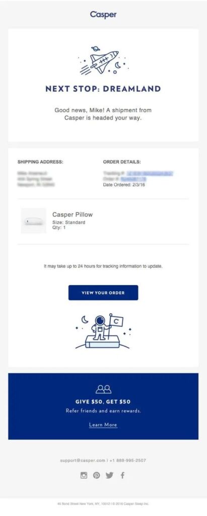
- Consistent Branding: The email maintains a fun and playful tone that aligns seamlessly with the brand’s distinct personality. This is reinforced using a monochromatic colour palette and doodle-style graphics, creating a cohesive and visually appealing brand identity.
- Logical Structure: The logical structure of the email enhances user experience. The logo is strategically positioned at the top for instant recognition, followed by clear and concise order updates and information. Promotional messaging is placed at the bottom, ensuring a smooth flow of information. Additionally, a social media bar is included, encouraging customers to connect with the brand on other platforms.
- Special Offer for Customer Advocacy: The brand employs a strategic marketing approach by offering a special $50 reward for every referral. This not only incentivizes customer advocacy but also promotes one of the most effective marketing strategies. By encouraging customers to refer others, the brand taps into the power of word-of-mouth marketing, fostering a sense of community and loyalty among customers.
Debenhams Feedback Request
What’s great about it:
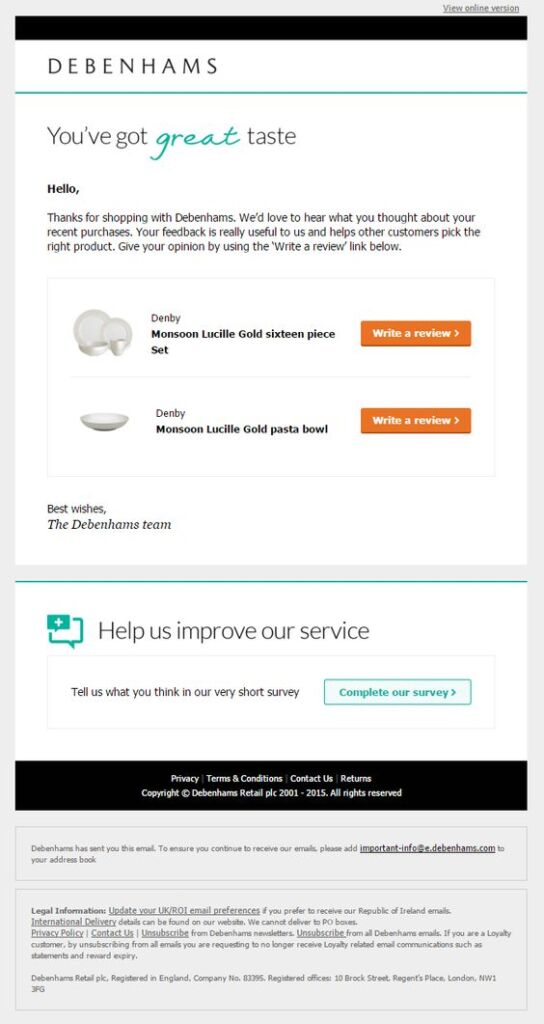
- Facilitated Review Process: Debenhams streamlines the review process for customers by displaying the recently purchased products along with relevant links for each. This considerate approach significantly enhances the likelihood of customers providing feedback on the items they have recently acquired.
- Product-Specific Review Request: Instead of seeking a general review, Debenhams asks customers to review specific products. This targeted approach aims to gather more high-quality testimonials, as detailed reviews tend to be more credible and insightful for potential shoppers.
- Customer-Centric Survey: The inclusion of a customer survey reflects Debenhams’ commitment to understanding and improving the customer experience. By actively seeking feedback through a survey, Debenhams demonstrates a genuine interest in meeting customer expectations and continuously enhancing their products and services.
Shoedazzle Order Confirmation
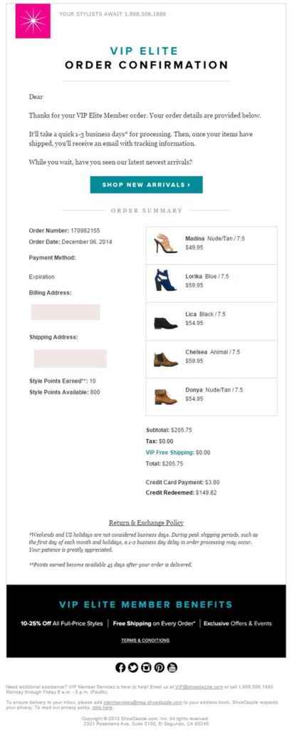
What’s great about it:
- Product Images for Instant Identification: Utilizing product images in the email is crucial, especially when product names lack descriptiveness. This visual aid allows customers to quickly and accurately recognize the items they have purchased, reducing any potential confusion.
- Exclusive Member Benefits: Incentivizing customer loyalty is a smart strategy. By offering exclusive perks such as free shipping, special offers, and discounted prices for repeat customers, the brand not only rewards its loyal base but also encourages continued patronage. This can significantly contribute to building a strong and dedicated customer community.
- Clear Timescales and Tracking Information: Managing customer expectations is key to a positive post-purchase experience. By specifying the timescales for order processing and shipping, along with providing tracking information, the brand ensures transparency. This clarity helps customers understand and anticipate the progress of their order, fostering trust and satisfaction.
Item World Order Confirmation
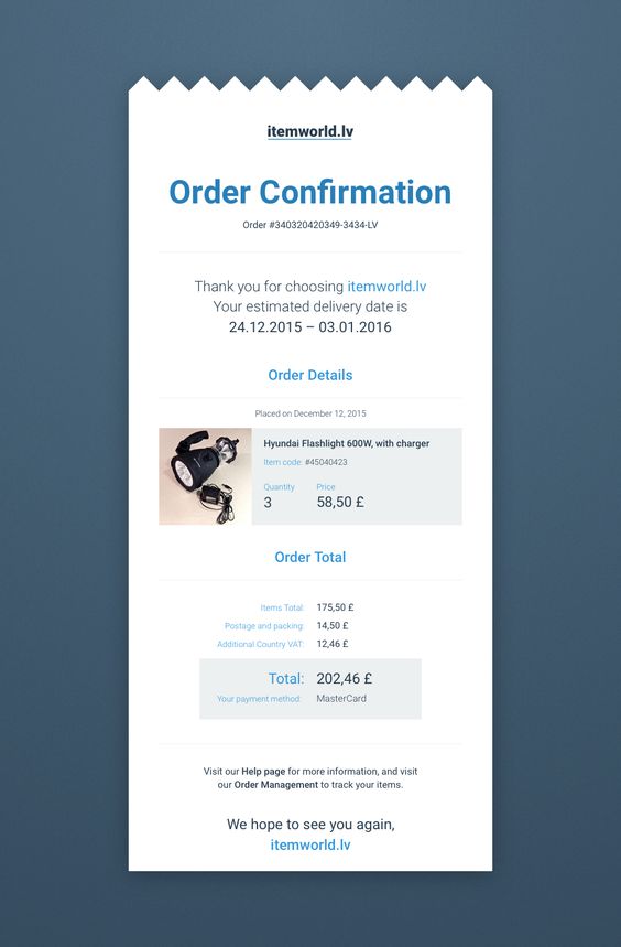
What’s great about it:
- Strategic Design: The email’s visual presentation takes inspiration from a physical receipt, injecting a playful element to the overall minimalistic design, making the communication more engaging and memorable for the customer. This design choice sets the brand apart and creates a positive association.
- Estimated Delivery Date: Providing customers with a clear estimation of when they can expect their order contributes to a transparent and customer-friendly experience. It manages expectations, reducing uncertainties and enhancing overall satisfaction.
- Product Images: Including images of the purchased products allows customers to visually connect with their order. This not only aids in swift identification but also enhances the overall comprehension of the content, especially for customers who may be more visually oriented.
- Coloured Headlines: The strategic use of coloured headlines serves a dual purpose. Firstly, it adds a touch of vibrancy to the email, making it visually appealing. Secondly, it helps in segmenting different sections, making it easier for the customer to navigate and locate specific information. This contributes to an organized and user-friendly email structure.
